Last updated: July 1, 2026
Most beginner articles about market indicators list a dozen data points as if they all deserved equal daily attention. In reality, economic indicators and market indicators answer two different questions. Mixing them without knowing which is which leads to trading on stale information. By comparison, the first kind describes where the U.S. economy has already been. The second prices where investors think it is heading. On July 13, 2022, the Bureau of Labor Statistics reported June 2022 CPI at 9.1% year over year. That reading was the highest since November 1981. Consequently, that single release rearranged how markets read every subsequent indicator that summer.
What Economic Indicators Actually Measure
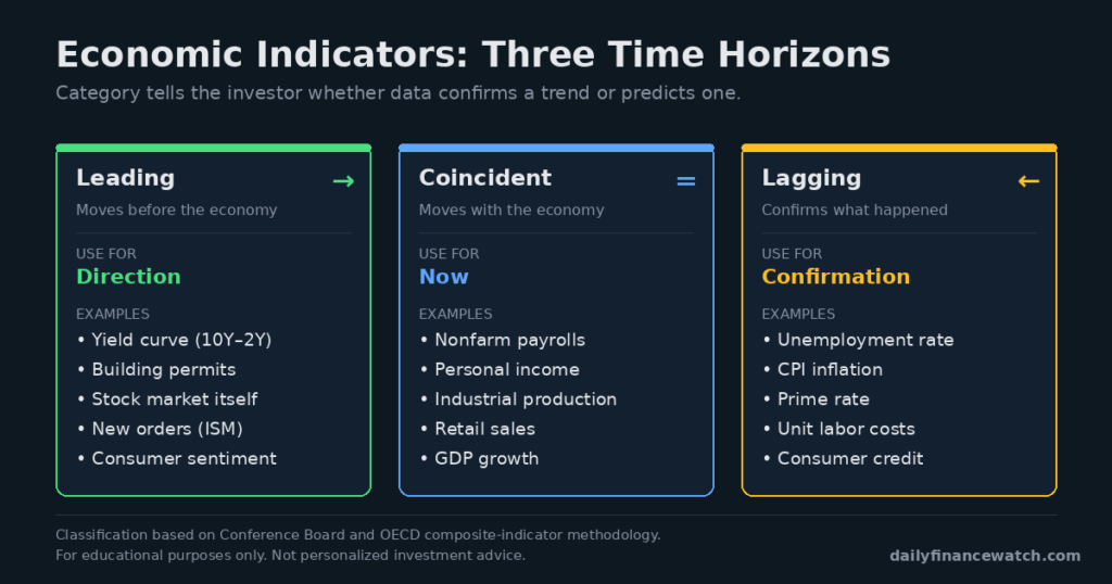
Category tells the investor whether the data confirms a trend or predicts one.
Economic indicators fall into three time-horizon categories. For example, leading indicators — the yield curve, building permits, and stock market itself — move before the economy does. By comparison, coincident indicators such as nonfarm payrolls, personal income, and industrial production move with the economy in real time. In contrast, lagging indicators confirm what has already happened. These include the unemployment rate, CPI inflation, and average duration of unemployment. For a beginner, this classification matters. The same data point can be misread as a prediction when it is actually a confirmation.
Economic Indicators: Reading the Direction of Causality
Most beginner mistakes with economic indicators come from assuming that a lagging data point predicts the future. However, unemployment peaks after a recession ends. Furthermore, CPI inflation peaks after monetary tightening has already worked. As a result, a rising unemployment rate does not necessarily predict a further downturn. It often confirms one that is nearing its low point. In addition, professional macro investors typically pair one leading indicator with one lagging indicator. The leading measure gives direction, and the lagging measure gives confirmation.
Four Data Points Long-Term Investors Should Track
Not every economic release deserves attention. Four indicators cover most of what a long-term investor needs to know. They are unemployment, inflation, the federal funds rate, and gross domestic product. By comparison, each is released on a predictable schedule by a specific U.S. agency, and each answers a slightly different question.
| Indicator | Source | Release Frequency | What It Tells You |
|---|---|---|---|
| Unemployment rate | BLS (jobs report, first Friday) | Monthly | Labor-market slack, coincident |
| CPI inflation | BLS (mid-month) | Monthly | Price pressure, lagging |
| Federal funds rate | Federal Reserve (FOMC, 8x/yr) | ~6-week cadence | Policy stance, forward-looking |
| GDP growth | BEA (quarterly) | Quarterly | Total output, coincident |
Source: U.S. Bureau of Labor Statistics, Federal Reserve, Bureau of Economic Analysis (official release calendars).
Unemployment and CPI are released monthly by the Bureau of Labor Statistics. Jobs data lands on the first Friday of each month, and CPI mid-month. Meanwhile, the federal funds rate is set by the Fed’s Open Market Committee about eight times per year. GDP is released quarterly by the Bureau of Economic Analysis.
For example, the June 2022 CPI print released on July 13, 2022 came in at 9.1% year over year. That reading was the highest since November 1981. By comparison, U.S. CPI stayed near the Federal Reserve’s 2% target for most of the two decades before 2021. In particular, the June 2022 print compressed the Fed’s remaining hiking cycle. Four consecutive 0.75% hikes followed over the next six months.
Reading Market Signals: VIX, Yield Curve, and Valuation
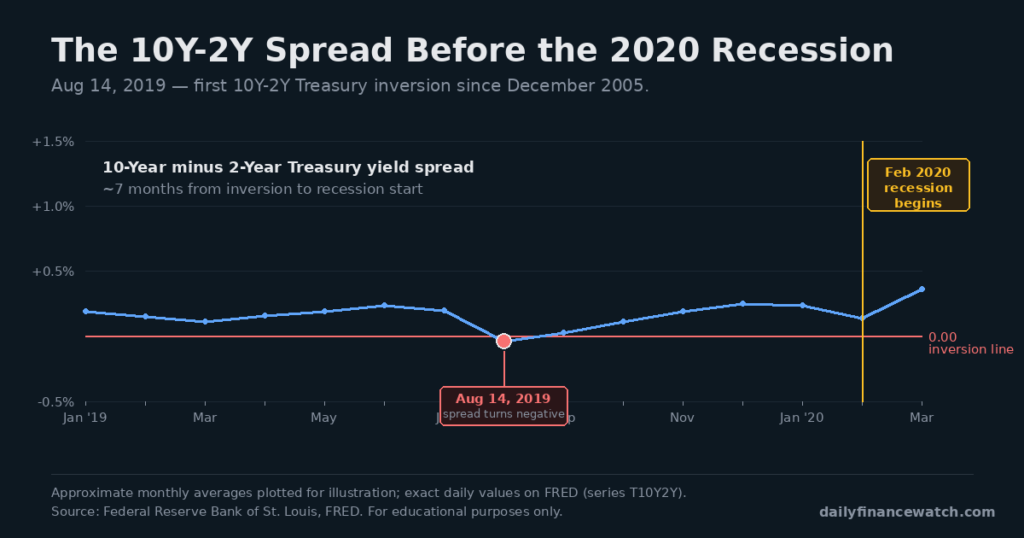
The spread turned negative on Aug 14, 2019 — the recession started about seven months later.
Three market indicators dominate what long-term investors actually need to watch. The VIX, or CBOE Volatility Index, measures expected S&P 500 volatility over the next 30 days. When the VIX rises sharply, it typically reflects institutional demand for downside protection. Readings above 30 tend to accompany periods of stress. In particular, the VIX closed at an all-time high of 82.69 on March 16, 2020. That peak came at the onset of the COVID pandemic. Sustained readings above 30 have historically coincided with recessions or major sell-offs. However, elevated VIX readings do not predict direction. They only price how much movement participants expect over the next month.
Furthermore, the yield curve flags investor expectations about the future path of interest rates. The most-watched version is the spread between the 10-year and 2-year Treasury yields. Historically, inversions of that spread have preceded recessions, though timing has varied widely. According to FRED data, the 10-year yield fell below the 2-year yield on August 14, 2019. That was the first 10Y-2Y inversion since December 2005. It preceded the February 2020 recession by roughly seven months.
The third market indicator is valuation, measured most commonly by the trailing 12-month price-to-earnings ratio. A rising P/E ratio without matching earnings growth reflects expanding market optimism, not underlying strength. In contrast, a compressing P/E during an earnings expansion often reflects rising discount rates. For long-term investors, an extended-market P/E measure is often more useful than a single-quarter reading. The Shiller CAPE ratio is a common example. Consequently, no valuation measure is a timing signal. Each one only frames whether current prices sit high or low against a long history.
Watching Without Overreacting
Every widely-followed indicator carries the same limitation. By the time an individual investor reads about it, professional traders have already priced it in. Consequently, using indicators to time short-term trades is a losing proposition for beginners. However, this does not make the indicators useless. Long-term investors read them for context, not for signals. In particular, a beginner can check quarterly whether the direction of the economy still matches their portfolio assumptions. Adjustments should only follow a genuine multi-year regime change, not a single data print.
A common beginner suggestion is to check economic data releases daily and adjust positions accordingly. However, this misreads what the indicators do. In reality, most releases confirm what markets have already priced. Institutional macro desks act on shifts in expectations relative to consensus, not on the raw data. For a beginner who has already opened a brokerage account, the same energy is better spent on portfolio automation. The indicator itself rarely changes what a long-term allocation should look like.
Economic indicators and market indicators serve different jobs for a long-term investor. In particular, economic data confirms what has happened. Market data prices expectations about what will happen. Consequently, the practical approach for a beginner is a small, fixed reading list. For the economy, watch unemployment, CPI, the federal funds rate, and GDP. For expectations, watch the VIX, the yield curve spread, and a market-wide P/E measure. However, quarterly review is usually enough. For most beginners, the practical next step is to hold a broad index fund. The indicators then inform occasional context, not frequent trades.
For related reading: 5 Effective Strategies for New Investors and Best ETFs for Beginners.
Frequently Asked Questions
Which data points should beginners actually watch?
For long-term investing, four economic data points cover most of what a beginner needs. These are the unemployment rate, CPI inflation, the federal funds rate, and GDP growth. All four are released on public U.S. government calendars from BLS, the Federal Reserve, and BEA. In addition, three market indicators cover most expectations data. These are the VIX, the 10Y-2Y Treasury yield spread, and a market-wide P/E ratio. Quarterly review of all seven is usually enough for a beginner.
How often should I check these data points?
For most beginners, a quarterly review is sufficient. Economic releases arrive on a predictable calendar. The meaningful signal is usually the trend over 2 to 3 releases, not a single reading. In addition, market indicators such as the VIX rarely produce actionable signals between quarterly checkpoints. However, if a data point moves outside a multi-year range, a shorter cadence may be warranted temporarily. For example, CPI crossing above 5% after decades of subdued readings would justify closer attention.
Does the yield curve reliably predict recessions?
Historically, an inverted 10Y-2Y Treasury yield curve has preceded most U.S. recessions since the 1960s. However, the timing between inversion and recession has varied widely, sometimes running 6 to 22 months. In particular, false signals have occurred, such as a 1966 inversion that produced no recession. As a result, professional forecasters typically use the inversion as one input among several, not as a standalone timing tool. For a long-term investor, an inversion is context, not a signal to change allocation.
This content is for educational purposes only and is not personalized financial advice. Investing involves risk, including possible loss of principal.
© 2026 Daily Finance Watch. Excerpts under 50 words with attribution and a link back are permitted. Full-article reproduction requires written permission.